Friday, 16 September 2016

Iris Chart in Tableau

Create an iris chart segmented by Year showing distribution of SUM(Sales) and SUM(Profit) for each user in superstore.

What advantage does this chart provide over Scatterplot and bubble chart?

Background:-
What is an Iris Chart?.
Iridology, and Iridology charts, have been developed over the past 300 years, primarily by medical doctors in Europe and Russia, who had the opportunity in hospital and clinical settings to view thousands of irises of patients with similar conditions. 
Almost all early Iridology Charts were developed independently from one another; thus their similarities are more worthy of consideration, than their differences.
Sample Iris Chart looks as below:


Solution:-

1.Drag OrderDate into Columns,Sales into Size,Profit into Color and CustomerID into Detail.

2.Create the Following 2 Calculated Fields,Which are basis of iris.It is going to  Distribute Required Measure values in the form of iris using X,Y-Axis.


3.Drag X-Axis to Columns and Y-Axis to Rows.Select Entire View.


4.For both the  X-axis  and the Y-axis , click the drop down> compute using > Customer ID.


5.Change Mark Type to Circle.
6.Sort the Customer ID in the descending Order of Profits.

7.On the X-axis and Y-axis pills, click the drop down > deselect “Show Header".
8.Right-click the center of the view > format…

9.On the lines section, select “None” for gridlines and for zero lines.

10.Final Chart looks as below:


Question:-

What advantage does this chart provide over Scatterplot and bubble chart?

Answer: 
Scatter plots make it difficult to distinguish between marks with values close to zero because they get mashed together.

Packed bubble charts have little structure to them and we cannot fully control the circle packing to it.


Thanks Guru's,
Prazval.ks


Friday, 29 July 2016

Conditional Bump Chart in Tableau

On Bettings data(Click to Download):-
Create below bump chart of SUM(Daily amount bet) over continuous month of Bet date segmented by User group and Gender that meets the following conditions:
·         If the current month is greater than the same month of the previous year, add 1.
·         If the current month is greater than the previous month, add 2.
·         If the current month is less than the same month of the previous year, subtract 1.
·         If the current month is less than the previous month, subtract 2.


Step1: 
Drag Daily amount bet onto the rows shelf.  Drag Gender onto the columns shelf.  Drag User group onto the rows shelf and onto color.


Step2:
Right-click drag Bet date onto the columns shelf.  Select MONTH(Bet date).


Step3:
Change the mark type to area.


Step4:
Create the following calculation with name "Bump"


Step5:
Replace SUM(Daily amount bet) with "Bump" Field


Step6:
Click the  "Bump" field drop down > compute using > Bet date.


Final Output as below:


Thanks Guru's,
Prazval.ks


Thursday, 28 July 2016

Variable Size Bump Chart in Tableau

Using Gambling Data(Click to download)
Create Following bump chart showing each Gambling product's rank based on AVG(Daily number of bets) over time (quarter of Bet date). Size the lines by the number of distinct Gambling products in each quarter


Step1:
Drag Bet date onto the columns shelf.  Select continuous quarter.

Step2:
Drag Gambling product onto color


Step3:
Create the following calculated field 


Step4:
Drag INDEX() into Rows. 


Step5:
Right-Click on INDEX() and select Edit table calculation.

Step6:
Select "Advanced..." from compute using drop-down.


Step7:
Select Addressing  by Quarter of Bet date and Gambling product in that order.  Sort by average Daily number of bets descending.


Step:8
Select “Quarter of Bet date” from the restarting every drop down.


   Right-click on  Index axis > edit axis…


Step9:
Select “Reversed” for the scale.


Step10:
 Create the following calculated field 


Step11:
Drag  "Size" onto size


Step12:
Click the drop down on the Size,Select  Compute using > Gambling product.


Step13:
Double-click on the size legend.


Step14:
Select “By range” from the sizes vary drop down.


The desired output as below:


Thanks Guru's,
Prazval.ks


Thursday, 21 July 2016

Finding Renewal of subscriptions

Design a view to see all of my customers who have returned and bought again over time.(Renewals).


Step 1:- 
Add quarters to columns (right click and drag for dialogue box to open) 


Step 2:-
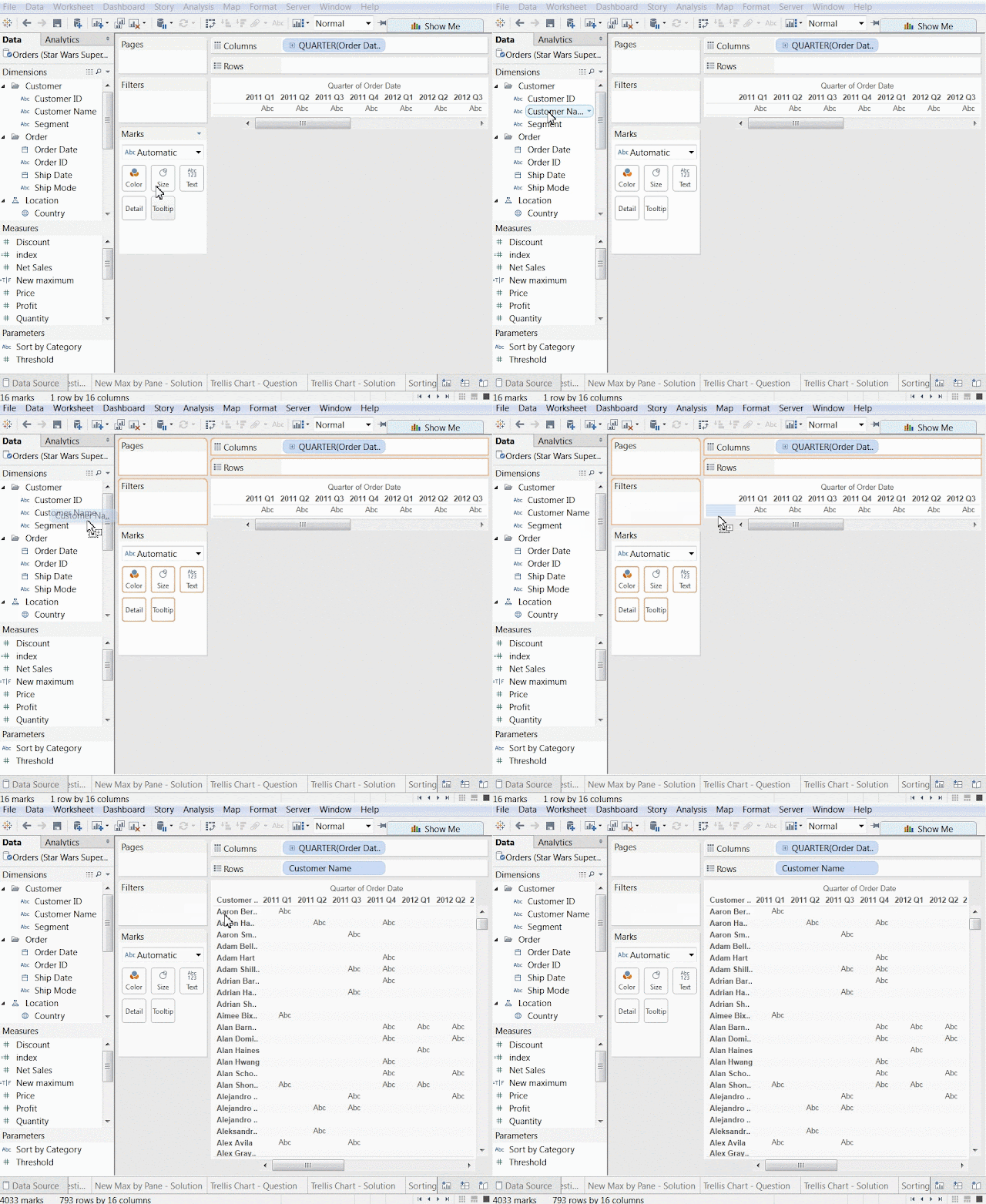
Add Customer Name to rows 


Step 3:-

Count customers who have renewed

Create a calculation that checks if the customer's current purchase is greater than 0 and if the previous purchase was greater than 0. 

In other words, did the customer purchase more than once in a row?


Step 4: 

Count customers who have renewed only once

  Step 4.1: 
  Create a calculation that sums up the counts of renewals 
  Step 4.2:
   Modify the calculation so that only one instance of the sum      of renewals remains.  

     Step 4.3: 
     Compute each calculation appropriately.


Step5:

Create final viz

  Step 5.1:
  Put Final Renewals on the Rows shelf


    Step 5.2: 
    Put Customer Name on Details 


     Step 4.3:
     Break Final Renewals up by Segment. 


Thanks Guru's,
Prazval.ks


DAX Time Intelligence Functions

   Thanks Guru's, Prazval.Ks