Hello Guys,
Recently I have been tasked with creating an organizational
structure map for one of my clients.The managers should be at the top, with all
of their employees underneath and Organisation is having the Different Levels(Hierarchy) of Employees.It’s quite worthy of visualizing the Hierarchy data
in the form of a Org Chart as the data flowing from one level to another.
This chart is also known as Decision Tree/org chart.
The end product should look like this,Based on the Below Sample Data.
Solution:
Create an Excel File with the Above Sample Data
Here the Data Looks simple,But Directly we cannot create the decision tree with the Above Data.
First We need to Prepare the data according to the levels in the organization which is quite Tricky and the whole Task is Based on that.
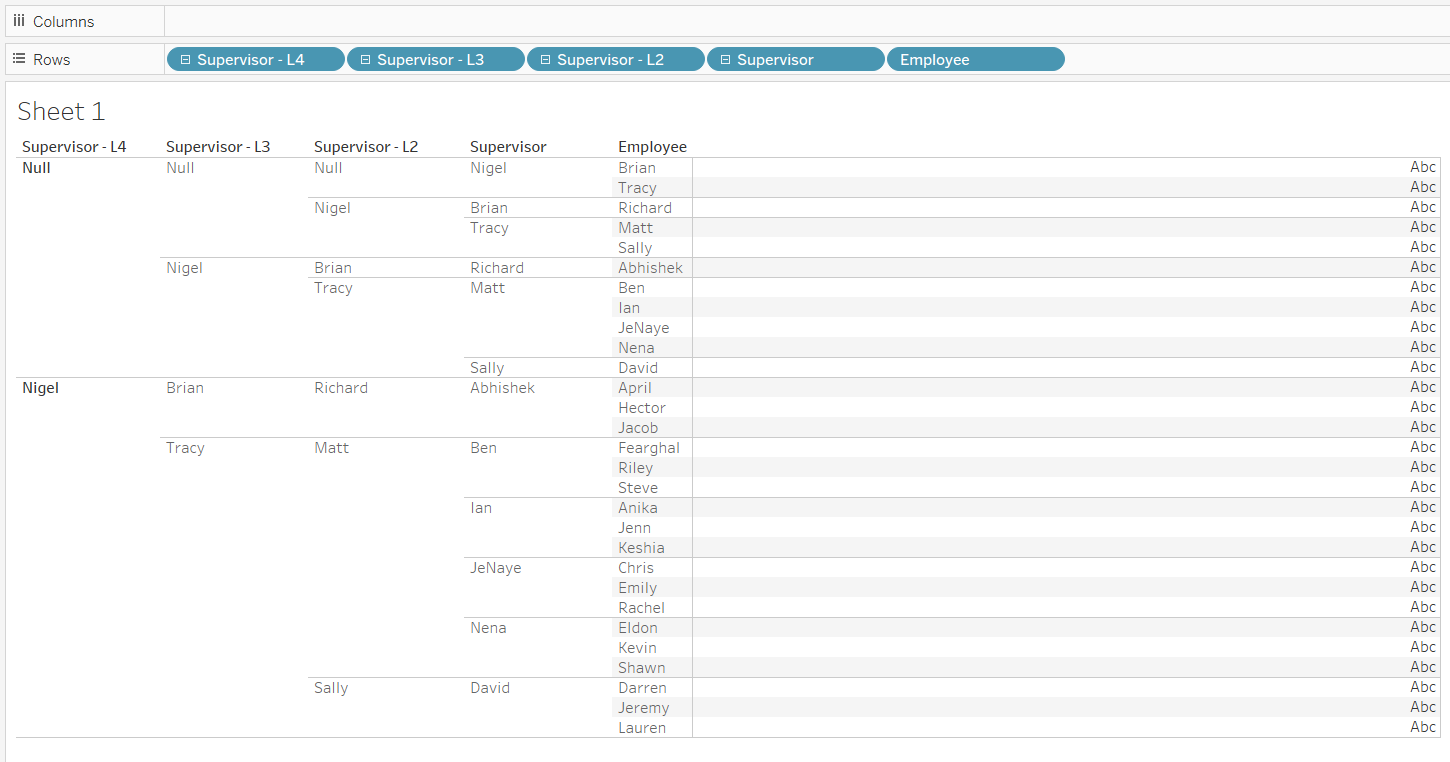
For example as we see the above diagram Brian is the Manager for Richard and Richard for Abhishek and then Abhishek for Jacob.
So Brian --> Richard --> Abhishek --> Jacob ,total of 4 Levels.
So we need to Perform Multiple Self Joins and union to get the required levels of data.
Step1:-
Join
the first table (Sheet 1) with Supervisor to Employee of the second instance of same the table (Sheet 11).
Then, rename Employee from Sheet 11 to be
"Supervisor - L2".
Step2:-
Once Again Join "Supervisor - L2" to Employee from third instance of same table(Sheet 12), then rename Employee from Sheet 12 to be "Supervisor - L3".
Continue this pattern for as many layers of hierarchy there are in the Organisation
Step3:-
Most employees are acting as the employee AND Managers,
so there we need two values(instances) of each of them in the data set so that
you have 2 marks for them, one going each way.
So for that we need
to Union the table to itself for the first instance(Sheet1).
Step4:-
The
other thing we need to prepare our data is ensure that there is a unique
identifier for each employee-Manager pair, so that a separate mark will
show for each. In order to do this, we create another self join on the now
unioned tables, but this time we'll join Employee to Supervisor of sheet15.
The final Data-Model looks as below:
Step5:-
Create a hierarchy based on your different levels of Supervisor.
This will help to keep the data set organized
Step6:-
Drag and drop the fields into the Rows to make sure it is joined correctly
Step7:-
Filter out NULLS and create INDEX() Calculated field.
It help us to order the circles
evenly across the different rows.
INDEX()
Step8:-
Create SIZE() calculated field,It returns no of rows in the Partition.
SIZE()
Step9:-
Create a calculated field with the Name "X" and with the following formula
INDEX()/(SIZE()+1)
This calculation is used to place the values along the Axis.
By using INDEX(),SIZE() and computing them across the table,Tableau can dynamically change and place the values evenly across the view
Step10:-
Create Another calculated field with the name "Y" and with the following formula
IF ISNULL([Supervisor]) THEN 5
ELSEIF ISNULL([Supervisor - L2]) THEN 4
ELSEIF ISNULL([Supervisor - L3]) THEN 3
ELSEIF ISNULL([Supervisor - L4]) THEN 2
ELSE 1
END
Convert "Y" to discrete,The Above calculation groups different levels of employees into discrete numerical buckets of different levels.
Step11:-
Create
calculated field with the name
"Employee + Supervisor", a unique identifier for each point.
This will allow us to have a mark for every data point.
if [Table Name] =
"Sheet1" THEN [Employee]+[Supervisor]
ELSE [Subordinate]+[Employee]
END
Step12:-
Create
a new Worksheet and then
Drag Employee to Detail, “X” to Columns, and AVG(Y) to Rows. Right
Click on “X” Field and then select Compute” X” using Employee.
Step13:-
Create a calculated field with the Name "Employee Sort" and with the following formula
IFNULL([Supervisor - L4], "") +
IFNULL([Supervisor - L3], "") +
IFNULL([Supervisor - L2], "") +
IFNULL([Supervisor], "") +
[Employee]
Step14:-
To Place the Employees in their respective places in the decision Tree as per the Hierarchy,Right-Click on "X" Field and
Select Edit Table - Calculation and then Select "Employee" Under Specific Dimensions,Then select Custom Sort By "Employee Sort" ,Aggregation as "Minimum" and Order as "Ascending",As Below.
This will tell the
points where to sit and what order they should be in (under their respective Managers).
Step15:-
We need to have a level of
detail higher than "Employee" on the view in-order to join the lines. Otherwise, with just
Employee on Detail, the marks will only function individually.
So Create a combined field on “Y”
and “Employee” as below to get both aspects of the data in the view.
Step16:-
Drag "Employee & Y (combined)" and
"Employee + Supervisor" to Detail as below
Step17:-
Filter out the nulls
from "Employee + Supervisor"
Step18:-
To Compute the "X" calculation correctly change the addressing in the following way,
Right Click on“X”
calculated Field by Selecting Specific Dimensions as "Employee" and "Employee +
Supervisor",
Calculate at the level of Employee.
Step19:-
Change Mark-Type to "Line".
Step20:-
Duplicate AVG(Y) and change mark
type to Circle.
Step21:-
Perform Dual Axis and then Synchronize the Axis.
Hide all the axis(headers).
Add Employees to the Label.
Step22:-
Finally Format the Circles by increasing the Mark Size and changing alignment on the Names